If you ask designers where their creativity is born, most of them will have the same answer.
It usually happens at the drawing tablet or in Photoshop. But if you ask them about inspiration, there are many different answers. One of them is – the weather.
Light, color, and atmosphere are all part of the equation to achieve design. If you add weather insights into your workflow, your templates and graphics will appear more natural, relevant, and visually stronger.
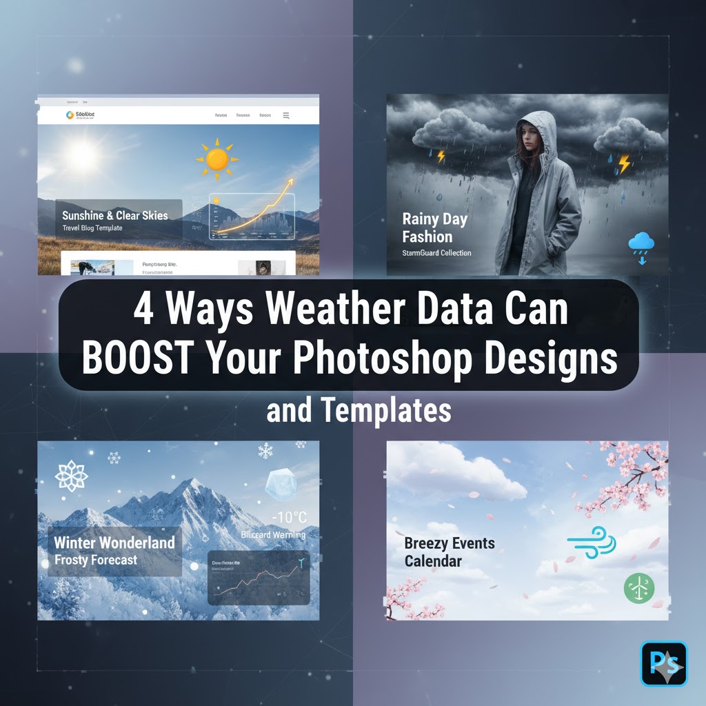
In this article, we’ll go over a couple of ways weather data can help you make the best Photoshop projects; there’s obviously more to it, but we’ll just go over these four to inspire you and to get your creative cogs spinning!
1. Match Colors with Real-Life Weather Moods
Color is so much of a storyteller tool.
One color palette can completely change the mood of your design. Even if you do the EXACT same design, but you change the color palette, you’re completely changing what the thing you’re trying to show means and how the viewer perceives it.
If you go with color pallets that follow and portray weather as you see it in real life, you’ll add yet another layer of context to guide these choices:
- Cloudy skies – muted, pastel colors that are well-suited for calm designs.
- Sunny skies – bright, dynamic colors that bring energy and cheerfulness.
- Stormy weather – moody, high-contrast color palettes that are perfect for dramatic designs.
Forecast and historical weather data can show us how colors work in nature based on all the various conditions that occur in the world around us. Some may be familiar (rain, snow, wind), but others not so much… Do you know what ball lightning looks like? Which colors are there, and how do they affect the surrounding area?
Or other weather phenomena, like red sprites, or fire rainbows (circumhorizontal arcs), or green flash, or frost flowers, or katabatic winds, or moonbows? There are so many weather-related phenomena out there that we don’t really think about when doing ‘design’.
If you’re building a spring Instagram template, for instance, and you know that it usually fogs up or clouds over in the mornings in your region, you can choose muted pastel gradients instead of too light colors.
These small touches make templates seem thoughtful and much more realistic.
Photoshop even offers various weather-related overlays (e.g., sun flares, mist, various brushes that can mimic rain/snow, etc.) with which you can experiment and see how you can work them into your design. Not only are you getting something new and exciting, but you’ll also be inspired to use this technique more often in the ‘creative’ phase of the project.
That adds a touch of depth and reality that takes your design beyond generic stock templates.
2. Create Seasonal Templates That Are Realistic
Templates do save time, but the effect is massively amplified when they really portray seasons in real-world conditions.
That’s why weather patterns are so great; here are a few examples:
- Spring – pastel colors, soft textures, floral details, wind effects, very green grass.
- Summer – warm and bright colors, saturation, clear blue sky with no clouds; absolutely no rain.
- Fall – warm browns (leaves on the ground), golden oranges, gentle shading, greys, dying nature, gloomy and rainy effects.
- Winter – cool blues, icy textures, frost effects, white (snow), any cold colors go great; if you add a small fire, it quickly becomes the focal point of the whole thing because of the contrast in both colors and meaning (warm vs cold).
Photoshop layers can be adjusted to mimic expected levels of light for the season, and templates/mockups can create a uniform appearance when applied to other settings, so that the whole project follows the same design style.
3. Weather-Inspired Atmosphere
If you’re trying to simulate realistic real-world weather conditions, then it’s best to portray them as they would appear in the real world.
For example, a light fog might form on top of a lake early in the morning, or dark grey clouds would start forming lightning before a huge downpour of rain.
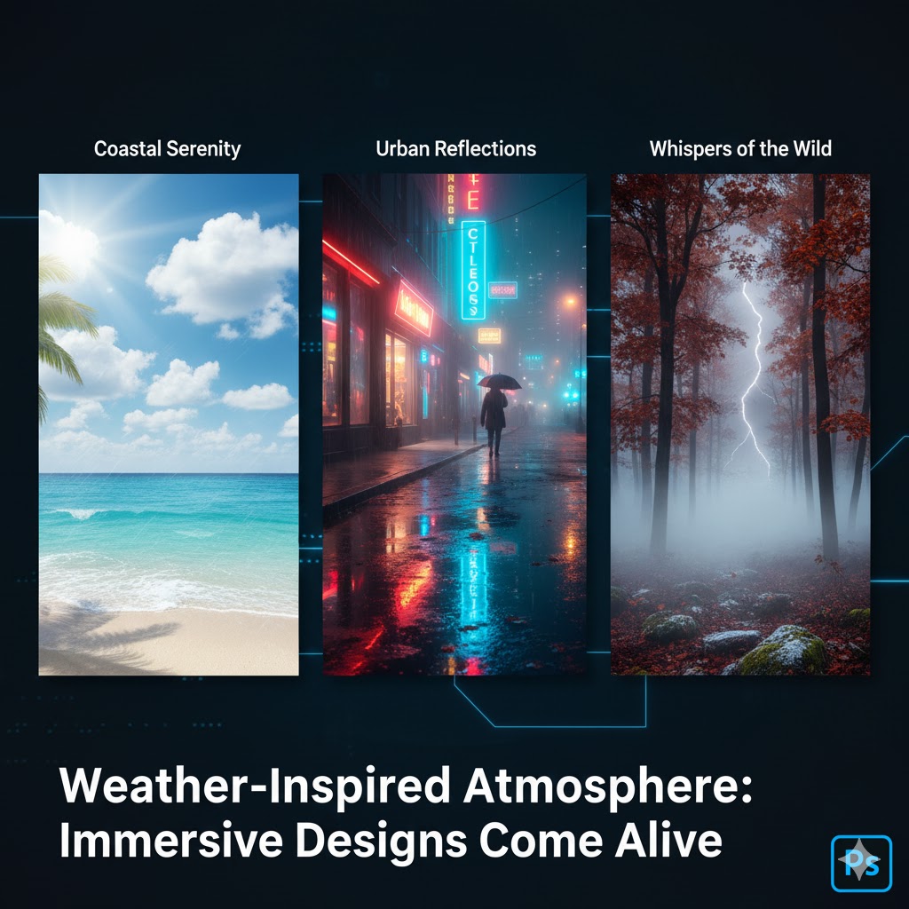
- Coastal templates – sunlight, scattered clouds, light breeze affecting the area it interacts with, etc.
- Cityscape layouts – wet shiny streets after rain, glow and color vibrancy from the water puddles reflecting everything, street lights contrasting the cold night, early morning fog reducing visibility, etc.
- Outdoor seasonal designs – frost, snow, beautiful nature growing under the sun, fog/mist over an autumn forest indicating upcoming rain, lightning raging in the distance, etc.
When you layer these effects on your templates, designs become immersive. They’re no longer generic stock images but convey a place.
Even little things like soft shadows under clouds or sun break highlights can affect how people view your work.
4. Plot Social Media Graphics Against Future Weather
The most practical use of weather intelligence is content planning. Designers creating social media templates will typically make graphics in advance.
Having access to future weather allows your designs to align with the time:
- Sunny days – bright, cheerful visuals.
- Rainy days – soft, warm compositions.
- Seasonal changes – subtle changes in templates to reflect changing light and colors.
You can do more with your mockups/templates by adding forecast data and historical weather data into your design workflow. This way, your products become more lively, more realistic. And rest assured that the viewer will notice and appreciate this added touch.
And instead of taking an existing design and adjusting it afterward, it’s much more efficient to start with this idea from the get-go.
Conclusion
If you’re doing design, then you can use weather as a creative tool. Perhaps you’ve already done it in the past without realizing it. But now, you can do it intentionally, plus you’ll have a few guidelines on how to portray and imbue all four seasons and have the weather guide you in your design decisions.
If you think about how light, color, and atmosphere change with the seasons, it can boost your Photoshop projects and make them look deliberate and professional.
When you start a new project, don’t think only about shapes and layers.

